Are you creating an info-poster or an infographic? What are the differences?

Written by: Diane Christensen and edited by KT Alberta

The word “infographic” may have become an umbrella term for describing poster products that visually show some amount of quantifiable data. However, infographics and info-posters are very different visual knowledge products. How do we distinguish the two?

It all comes down to the type of data.

Infographics prioritize quantifiable values and convert them into complex data visualizations.

Info-posters are much more subjective and usually prioritize qualities and storytelling over quantifiable data.

Infographics and info-posters differ in design and purpose. The easiest way to demonstrate this difference is to compare an infographic to an info-poster:

INFO-POSTER

In the info-poster above, numbers are displayed but are not the driving force behind the poster. The story (in this case, about the benefits of the use of infographics online) is the driving force, and the numbers are used to support the telling of this story. The percentages and data visualizations are simple and easy to comprehend. However, there is no additional level of engagement. Most of the information on this info-poster can be absorbed in approximately ten seconds.

Takeaways (Source: understandinggraphics.com) :

Info-posters may have some data, such as simple pie charts or percentages, but the data does not serve as “the star.”  Some key features include:

  • Info- posters can convey multiple segments of information typically using words and numbers to represent quantitative data.
  • Info-posters generally use iconic-type graphic elements for visual design appeal and are typically vertical in orientation, similar to a wall poster.
  • They are meant to be read, usually from top to bottom and may incorporate simple infographic elements, but this does not change their purpose. They are created to collect a variety of facts and figures about a topic in one place and to communicate it in an interesting and easy-to-read format.

On the other hand, infographics are designed to engage the audience more deeply, which is why they can be a useful tool for knowledge translation.  Take a look at the infographic below:

INFOGRAPHIC

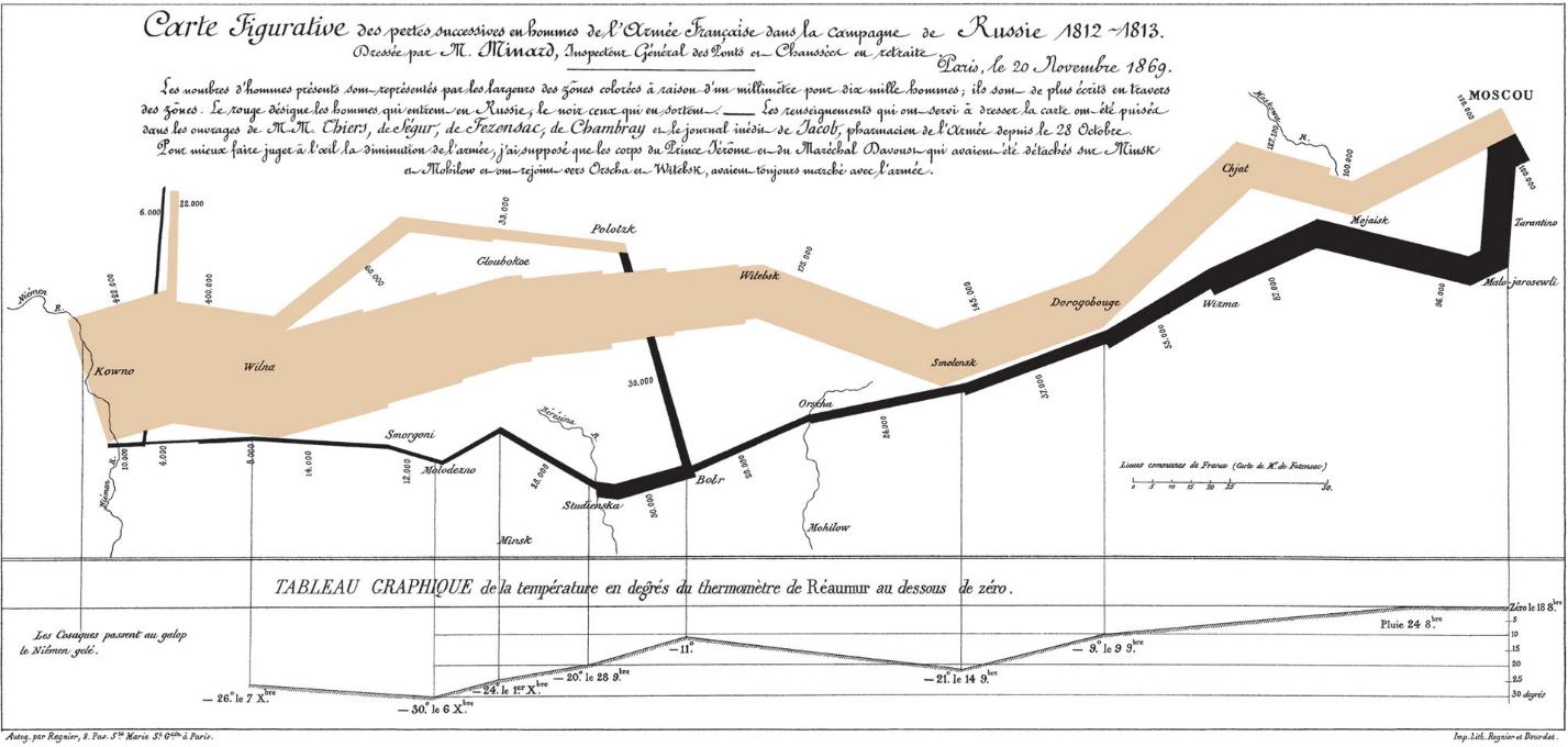
The example above is considered to be one of the best infographics of all time. It depicts Napoleon’s invasion of Russia, where 422,000 soldiers left France and 10,000 returned. It offers four different “levels” of data:

  1. Size of the army (line width)
  2. Movement direction (line direction and colour)
  3. Temperature (shown at the bottom)
  4. Location

The audience need not understand French in order to grasp this infographic. The numbers come together to form a complex data visualization. From that data, a narrative emerges. The narrative is not subjective, and the viewer can draw several conclusions.

Takeaways (Source: understandinggraphics.com)

An infographic is a visual representation of information, data or knowledge and some key features include:

  • Symbols or visual elements that typically represent quantitative information.
  • Color, size and shape usually represent the qualitative aspect.
  • They use text as labels and for short explanations to make the data useful.
  • They are abstract visuals and can compress information thereby, making it manageable.
  • Ultimately, they help us to see information in new ways, which gives us greater insight into understanding and problem-solving. A viewer doesn’t quite read an abstract infographic; the knowledge transfer process involves studying, analyzing and exploring the infographic.

How do you decide which type of product to use?

It will depend on the type of knowledge, the context and the audience, among other factors. Multiple data sets can be translated into an infographic, whereas, if the aim is to communicate a pre-defined message that is accentuated by data, an info-poster is likely the better option.

While info-posters and infographics may seem similar, the primary focus of each is vastly different. Infographics make the story of the data the primary focus and allow the audience to derive a narrative, while info-posters prioritize a pre-determined storytelling message with data as a support system.

If you want to learn more about infographics and other visual knowledge products, our friends at Knowledge Nudge have provided some great tips!

Until next time!

Stay connected with AbSPORU and our research by signing up for our emails.

CALGARY

University of Calgary Foothills Campus
3330 Hospital Dr NW
Calgary, AB T2N 4N1

EDMONTON

College Plaza
1702, 8215 112 St NW
Edmonton, AB T6G 2C8

Land Acknowledgment

The Alberta SPOR SUPPORT Unit operates on and acknowledges the lands that are the traditional and ancestral territory of many peoples, presently subject to Treaties 6, 7, and 8. Namely: the Blackfoot Confederacy – Kainai, Piikani, and Siksika – the Cree, Dene, Saulteaux, Nakota Sioux, Stoney Nakoda, and the Tsuu T’ina Nation and the Métis People of Alberta. This includes the Métis Settlements and the Métis Nation of Alberta. We acknowledge the many First Nations, Métis and Inuit who have lived in and cared for these lands for generations. We make this acknowledgment as a reaffirmation of our shared commitment towards reconciliation, and as part of AbSPORU’s mandate towards fostering health system transformation.